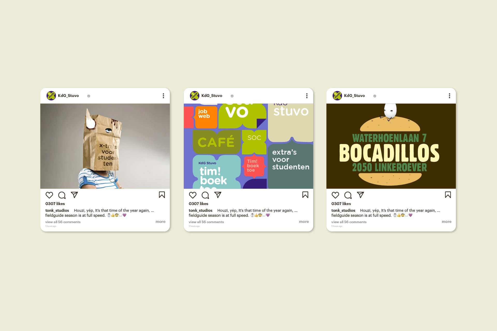
The social services department of the Karel de Grote Hogeschool (Kdg stuvo) wanted to create more brand awareness and exposure through a new corporate identity.
client — Karel de Grote Hogeschool
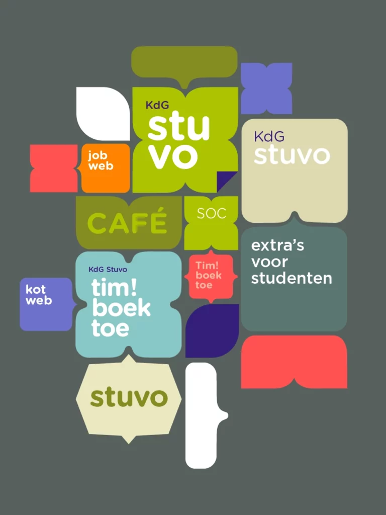
Initially, de Sociale Dienst (original name) had minimal or no connection with its parent organization, Karel de Grote Hogeschool. There was no visible or tangible link between them. The non-profit organization operated in two distinct areas: the Social Service, which handled all study-related and financial concerns, and TimBoekToe!, which was responsible for organizing social and party events. After 2 design sprints, KdG stuvo was born, 1 name, 1 identity for all study-related concerns.
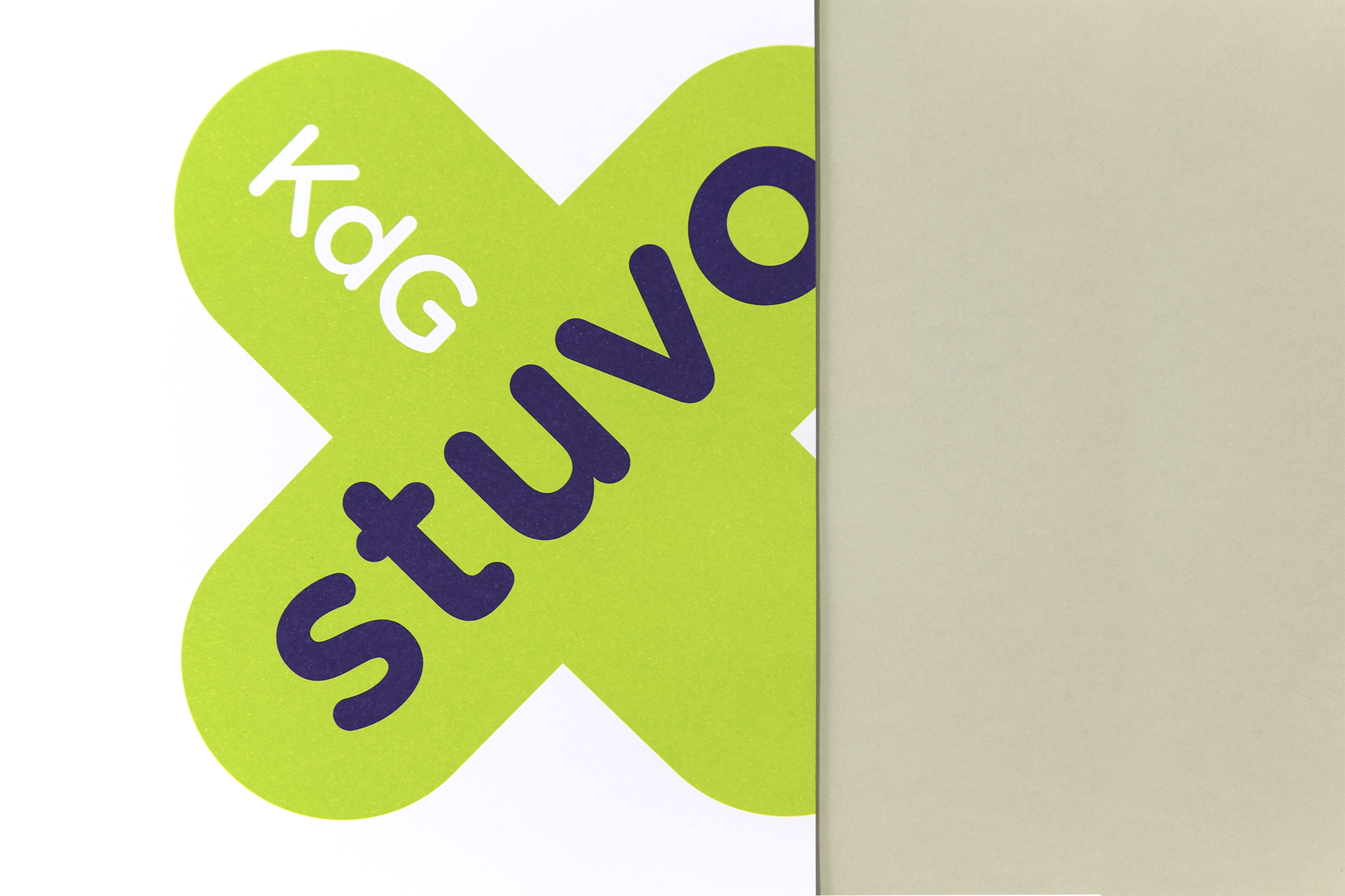
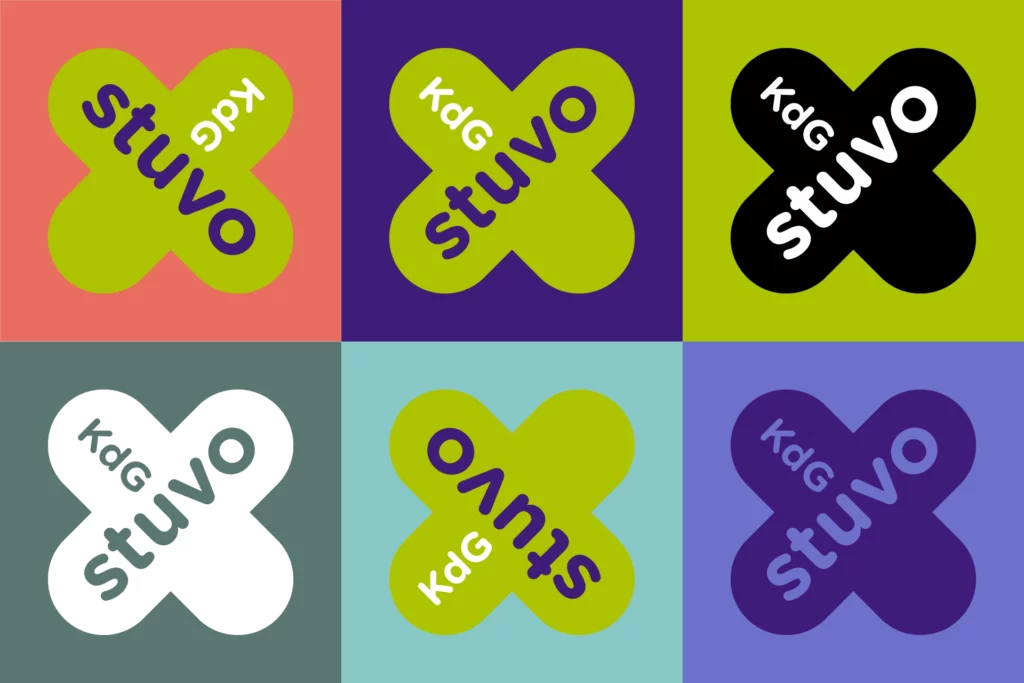
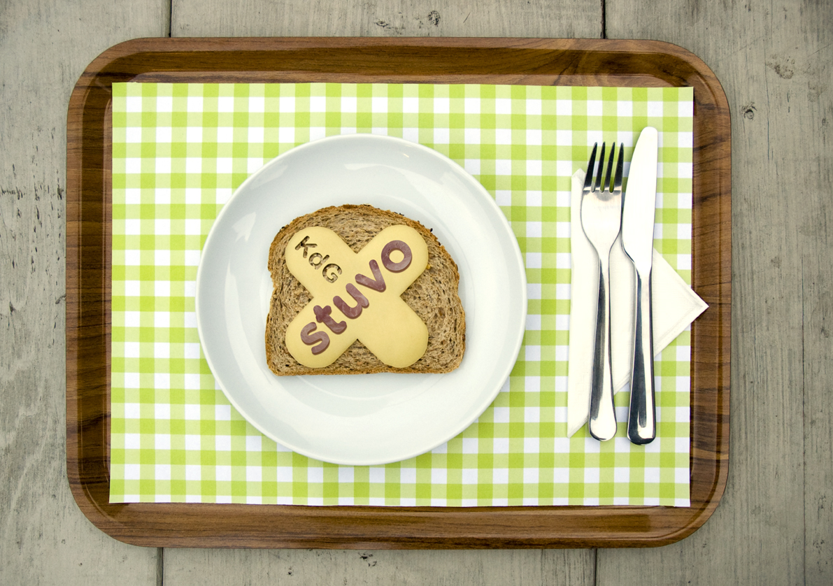
KdG Stuvo logo
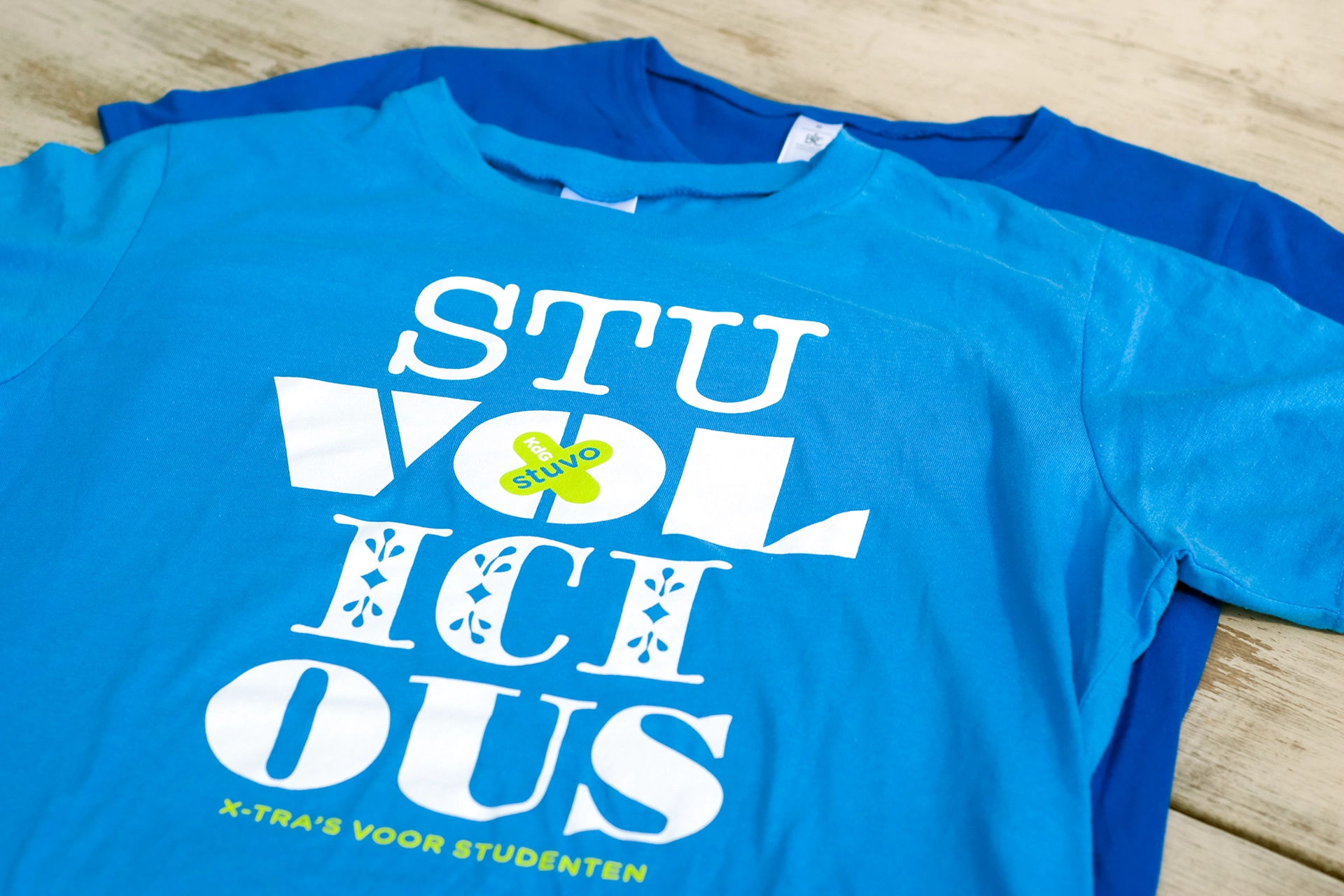
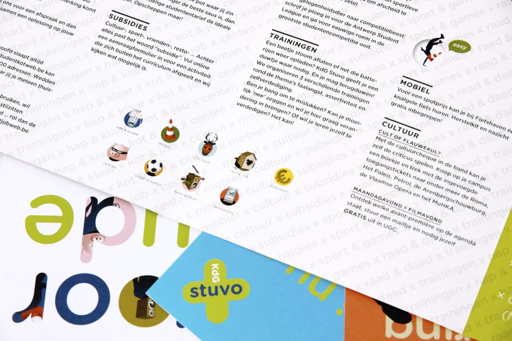
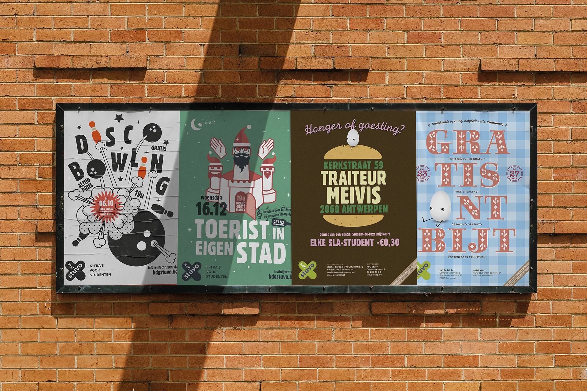
The logo's core design is based on the letter "x," inspired by the KdG cross of the parent brand, which also gave us the tagline "x-tra's for students."
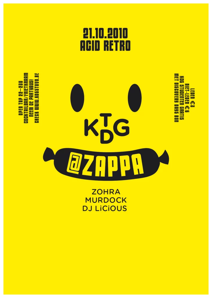
* a 2010 greetings card
In our Tonk Studios we concept, design & craft communication tools for a wide range of people and their businesses.
hello@tonk.be
+32 477 590 100
meaning tonk:
{slang} An item of value, or of perceived value, especially for sale.